
Pouring the Inspiration: Whiskey Embers Unveiled
Get ready to embark on a spirited adventure as we delve into the captivating world of logo design for our friends at Whiskey Embers! Known for their mobile bar mastery and top-notch bartending skills, Whiskey Embers is more than just a libation legend – it’s an experience in every sip.
Cheers to Collaboration: Understanding Whiskey Embers’ Vibe
Our logo design journey begins with clinking glasses and brainstorming sessions. We sat down with the passionate team behind Whiskey Embers to understand their brand personality, the essence of their mobile bar, and the energy they bring to every event. The goal? To distill these elements into a visual masterpiece that screams, “Cheers!”
Liquid Inspiration: The Color Palette that Pops
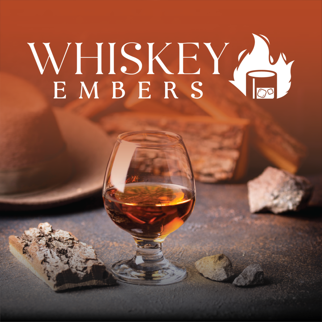
Colors are the soul of any logo, and for Whiskey Embers, we needed a palette as rich and diverse as their drink offerings. From the warm amber of aged spirits to the fiery reds reminiscent of a crackling fireplace, this color hue was chosen with the intent to evoke the warmth and conviviality that Whiskey Embers brings to the party.
Typography Tales: Crafting Letters with Character
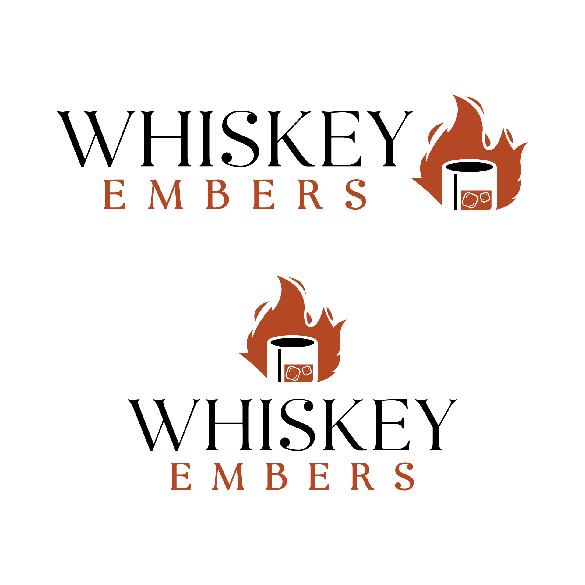
Meet the unsung heroes of logo design – fonts! We carefully curated a typography style that blends the elegance of a classic whiskey label with the contemporary flair of Whiskey Embers’ mobile bar persona. The result? A font that speaks volumes, whether etched on a barrel or splashed across a digital screen.
Bottling Up Creativity: Iconic Elements in the Emblem
Every great logo needs a defining element. For Whiskey Embers, it’s a carefully crafted emblem featuring a stylized iced whiskey glass, adorned with flames that dance with the vivacity of their bartending service. It’s not just a logo; it’s a visual representation of the roaring spirit they bring to every event.
The Magic of Mockups: Seeing the Logo in Action
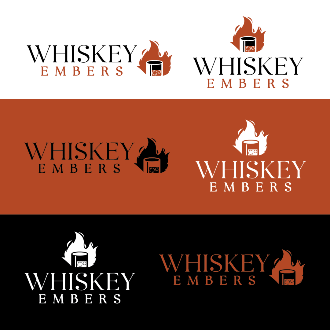
Transitioning from sketches to digital mockups is where the magic happens. We placed the logo on mobile bars, bartending stations, and even imagined it on Whiskey Embers’ branded merchandise. The result? A versatile emblem that seamlessly adapts to various surfaces, bringing the brand to life in every setting.